Daylight: Is it in the eye of the beholder? by Kevin P. McGuire
The goal of this tutorial is to clarify issues that are relevant to a discussion about
daylight and the visual perception of it. The following topics will be discussed:
Daylight: What it is, and some surprising findings.
The Kruithof Curve
The Human Eye
Chromatic Adaptation
References
Daylight: What it is, and some surprising findings
The words synonymous with daylight are "natural" or "true light".
Daylight is defined as the combination of sunlight and skylight
The daylight condition most commonly associated with a clear blue
cloudless day exists at about 6000K. Rarely, if ever, will you hear
someone walk out into these conditions and say, "Today is too cool"
or "too blue". However, if you take these same lighting conditions and
view them in an indoor setting your perception will be that the same
light you thought was "natural"outdoors now surprisingly appears bluish.
In this paper we will explore the physiological and environmental reasons
for this phenomenon and ways to overcome it.
Background
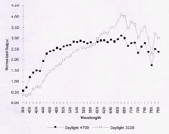
Our first encounter with this phenomena occurred when SoLux was used to illuminate
Vermeer paintings at the National Gallery of Art in Washington. An
experiment was set up so the proper amount of footcandles (20-30) illuminated
each painting. The observers were able to adjust the lighting to the most
preferred color temperature using SoLux at 4700K and standard MR-16's at
3000K while maintaining a stable footcandle level. The color temperature that
was most frequently chosen was 3500K. This was a little bit surprising
because 3500 appears yellow-orange to the eye under normal viewing
conditions, and the spectral power distribution supports this.
These findings could not blamed on untrained eyes because the people at the
Vermeer test were professionals with many years experience in the lighting of
art. (A curator from the National Gallery of Art and the NGA's chief lighting designer were
amongst the group) However, it was noted that museum light levels are much
lower than standard light indoor light levels. Does light levels at extreme
highs and lows and at points in between impact the eye's perception of color?
Historical and empirical evidence suggests the answer to this question
is yes.
The Kruithof Curve
Early work that touched upon the relationship between light levels and color
temperature was conducted by Kruithof . He developed a chart which
defined a region of high and low levels of illumination for a range of color
temperatures which were considered "pleasing" to a number of observers.
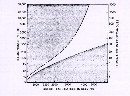
Kruithof provided the lighting designer with a breakthrough concept that has
withstood the test of time because he used only the sun and incandescent
sources for his study which yielded the purest possible spectral power
distributions for his study. Based on the Kruithof Curve, SoLux low voltage
daylight lamps should be used under the following illuminance guidelines:
| Color Temperature | Footcandles | Lux |
| 3500K | 18-200 | 194-2,153 |
| 4100K | 22-1500 | 240-16,147 |
| 4700K | 27-5000+ | 290-50,000+ |
| 5000K | 40-5000+ | 430-50,000+ |
Further refinements of the Kruithof Curve is currently being made by
Weintraub et al. using SoLux and the lighting system used at the National
Gallery of Art.
The Human Eye
So what causes this changing perception of color? Part of the answer lies
with the level of lighting conditions outdoors, indoors and the way the human
eye functions under these very different lighting conditions.
The number of footcandles measured during a typical cloudy day in Rochester,
NY is about 3,200 footcandles with a color temperature of 6550K. A sunny day
measures out at 13,600 footcandles and 5000K. The number of footcandles
required for reading and displaying items in a retail store is between 75 and
150 footcandles and the number of footcandles required in a museum
due to conservation issues is roughly 20 footcandles.
Lighting levels produced by outdoor, indoor, and museum lighting differ by a
factor of about ten or more in each case. In order to respond to these
changes the iris, the entrance into the human eye, is designed to contract
and dilate rapidly. By expanding and contracting the iris controls the amount
of light incident upon the retina. The retina contains the rods and cones
responsible for vision. The light incident upon the retina is proportional
the square of the pupil diameter. If the pupil doubles in size the amount of
light entering the eye increases by a factor of four. The iris can expand to
8mm in dim light and contract to 2mm in bright light. This factor of four
change in the diameter of the iris corresponds to a 16 times change of
brightness on the retina, however the light level change from the museum to
the sunny outdoors in Rochester is 680 times. The additional light level
factor of 42.5 that the iris can't correct leads to a dynamic interplay
between the two light receptors, rods and cones.
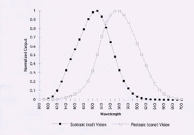
There are approximately six million cones and one hundred and nineteen
million rods intermingled non-uniformly over the retina. The cones which are
primarily located in the center of the retina in a region called the Fovea
and have a responsivity as shown in figure 4 peak at 555nm (green region).
Until recently, the cones have been primarily credited with color vision.
The rods, whose responsivity peak at 508 nm (blue region), have traditionally
been credited only with night vision
.
In a 1996 paper entitled, "The Reengineering of Lighting Photometry," Dr. Sam
Berman sets forth a new theory on the workings of the human eye where the
function of the rods and cones are not mutually exclusive as previously
believed.
To prove his theory that rod receptors were at work all the time, Dr. Berman
measured pupil diameters which were exposed to light sources of equal total
output but with different spectral power distributions. The sources which
emitted more energy closer to 508nm and away from the peak cone sensitivity
of 550nm resulted in smaller pupil sizes proving his theory that not only
were rod receptors at work at all times, but also that the rods controlled
pupil size and not the cones as previously thought.
What this all means to the observer looking at a painting outdoors, indoors
or in a museum is this: Outdoors, the light is very bright causing the pupil
to contract, however, the change in the pupil diameter is not great enough to
offset the large increase in illumination. With the higher light levels the
responsitivity of the cones is dominant yet the rods to a much smaller degree
are still contributing to the overall response. With this large amount of
light entering the eye, 6000K appears white.
Moving indoors, the pupil size grows allowing a larger proportion of light to
pass. Once again, the iris is not capable of maintaining a constant level of
illumination on the retina. Under these reduced lighting conditions, rods
with blue sensitivity come more into play and hence the 6000K light that
looked white outdoors now appears bluish and 4700K appears white. By
traveling to the museum, we decrease our light level another factor of 10
times from about 200 to 20 footcandles. The rods are utilized even more and
4700K light which appeared white under normal indoor conditions now appears
bluish or "cold" to the museum curator and 3500 appears white.
It is important to point out that as the iris contracts and less light is
allowed to enter the eye, the size of the image on the retina does not
change. Thus for a given field of view, the same amount of rods and cones are
always exposed, it is the amount of light which triggers a larger visual
influence of the cones for higher illumination and rods for lower
illumination.
The interaction between the iris, the rods and the cones gives a plausible
explanation to our observation that people will label direct sunlight at
6000K "white" yet say that 4700K at low light levels "looks a little blue".
Chromatic Adaptation
While the Kruithof curve characterizes a physiological condition that
influences the perception of color, chromatic adaptation is a psychological
condition that also plays an important role. Color adaptation is a
rebalancing of the color response of the eye as the spectral composition of
the scene changes. The brain is constantly working to process the
information fed to it by our eyes. Sometimes the brain needs to "massage"
the data; without this ability, most of the light sources we work and play
under could quite possibly make most of us ill. Take for example fluorescent
lights; to the eye, a room illuminated by cool white fluorescent lights
appears white, however, a photograph taken in the same room reveals a green
glow.
Combining the effects of chromatic adaptation with large illuminance
fluctuations creates some interesting effects. For example, at night, the
headlights on a car appear bright and white however, during the day, the same
headlights appear dim and yellow. The inverse of this example is to
introduce a small beam of daylight into a room illuminated by incandescent
light. While the room appears white, the beam of daylight appears blue.
Unless the same beam of daylight is viewed in an environment of daylight, it
would be hard to convince the observer that incandescent light is yellow and
daylight is "white" and not "blue"
Returning to the original question regarding daylight-is it "blue", or is it
"white"? Obviously, there is not a single or simple answer. It depends on
the level of intensity of the source and the surrounding environment. At
high levels of intensity (i.e. out doors) daylight with color temperatures
ranging from 4500-6000k all appear white to brain. At intermediate levels
indoors, 6000k will tend to appear blue especially when directly compared to
incandescent at 3000k and 4100K-4700K appears white. At lower intensities
(i.e. museums) daylight anywhere in the 4500-6000k range will seem a little
blue and 3500K-4100K will appear white.
For designers lighting an area or an object with daylight, they must take
into consideration many aspects including- how brightly lit the room needs to
be, and what adaptation have the viewer's eye's undergone and of course, what
it is they are trying to illuminate. With the advent of the SoLux lamp at
4700K, 4100K and 3500K the lighting designer will have the ability to create the
perfect lighting condition for whatever the application.
Kevin P. McGuire Author/Inventor SoLux Technology
References
S.M Berman, "The Reengineering of Lighting Photometry," Publications of the
Lighting Research Group, Lawrence Berkeley Laboratory, California, 1995
Roy S. Berns and Frank Grum, "Exhibiting Artwork: Consider the Illuminating
Source, "Color Research and Application, vol. 12, no. 2, April 1987
Robert G. Davis and Dolores N. Ginther, "Correlated Color Temperature,
Illuminance Level, and the Kruithof Curve," Journal of the Illuminating
Engineering Society, Winter 1990.
IES Lighting Handbook, Lighting Handbook Eighth Edition, IESNA, New York,
1993
Optics, Hecht & Zajac, Addison-Wesley Publishing Company Inc., 1974
Send mail to webmaster@soluxtli.com with questions or comments about this site.
Copyright © 2000 Tailored Lighting Inc.
Last modified: September 26, 2000
